


Your Can of Pepsi Is About to Look a Little Different
It’s getting a new logo and a "younger" look.
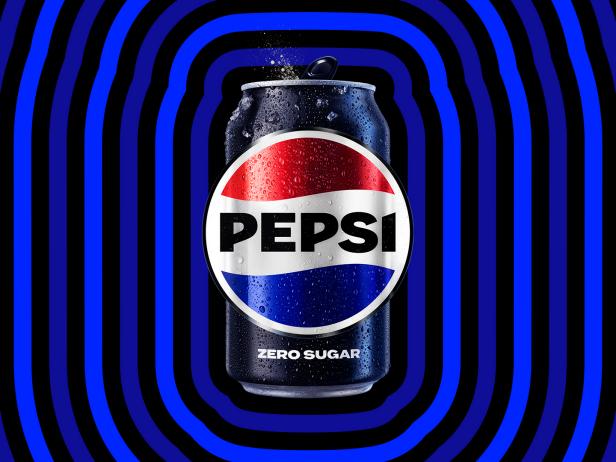
Photo courtesy of Pepsi
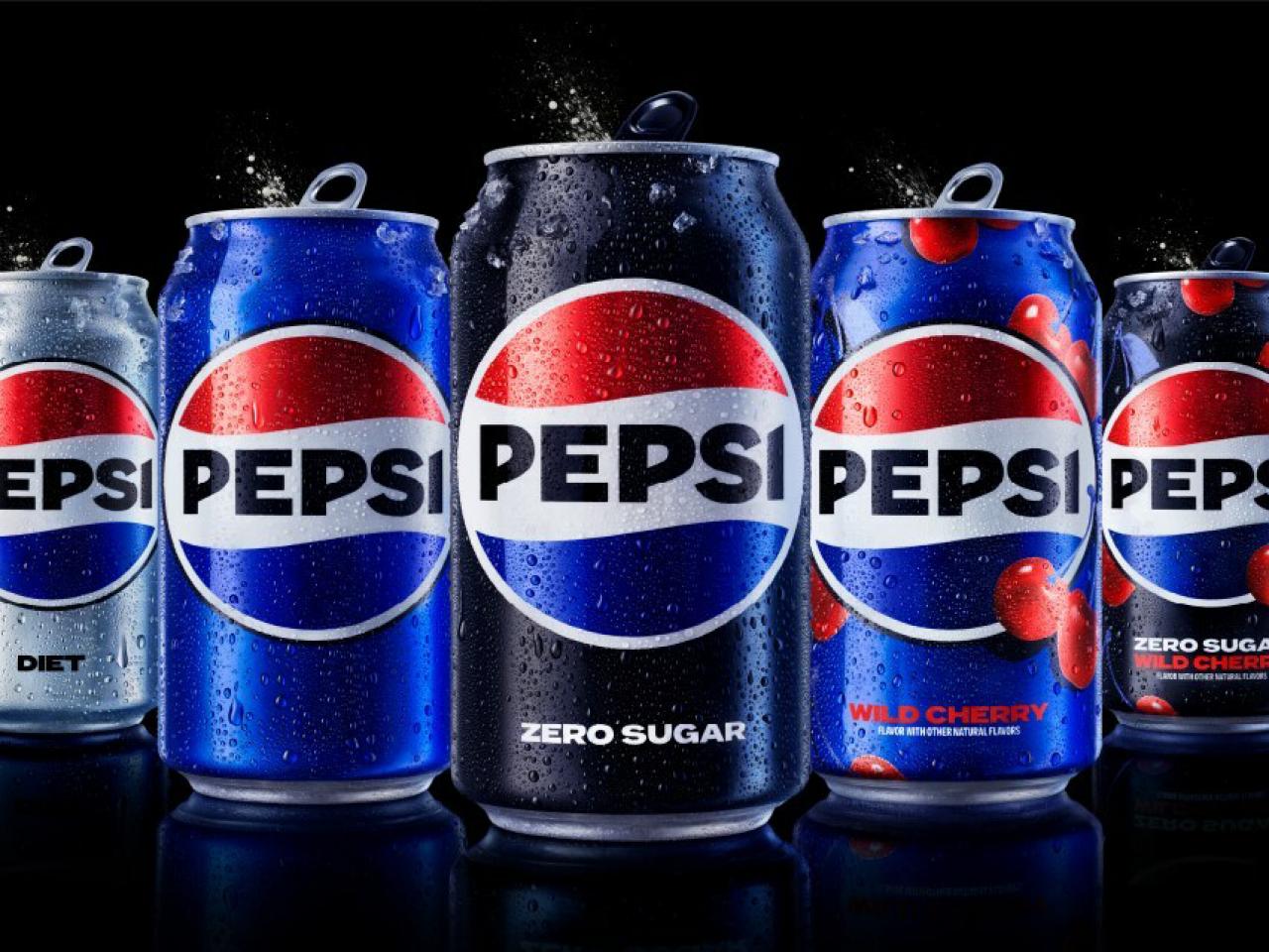
Don’t look now, but your can of Pepsi is about to get a new, “younger” look. To mark its 125th anniversary, the cola brand is changing up its globe logo and “visual identity" for the first time in 14 years. The new design, which will roll out across all Pepsi packaging and equipment, physical and digital products, fleet, fashion and dining, in North America this fall and globally in 2024, is intended to look more “modern” and “current,” according to the brand.
So what’s changed? The globe and wordmark have been combined to put the Pepsi name and imagery front and center. The color palette has been updated, with the introduction of electric blue and black to “bring contrast, vibrancy and a contemporary edge to the classic Pepsi color scheme.” The addition of black also underscores the brand’s commitment to Pepsi Zero Sugar.
Other changes include a distinct new can silhouette, a more pronounced typeface to evoke Pepsi’s “confidence and unapologetic mindset,” and a “signature Pepsi pulse” aligning the “ripple, pop and fizz” of Pepsi-Cola with a sense of movement. Overall, the new look is intended to pay “homage to the brand’s rich heritage while taking a big leap toward the future.”

Photo courtesy of Pepsi
Pepsi “has consistently reinvented itself over 125 years to remain a part of pop culture and a part of people’s lives,” Mauro Porcini, senior vice president and chief design officer of PepsiCo, says in a press release. “We designed the new brand identity to connect future generations with our brand’s heritage, marrying distinction from our history with contemporary elements to signal our bold vision for what’s to come.”
Todd Kaplan, Pepsi’s chief marketing officer, says the fresh look heralded “a new era” and the big, bold brand identity would “help people find new ways to unapologetically enjoy the things they love.”
Yeah, it’s a lot to drink in.
Related Content:


.jpg.rend.hgtvcom.231.174.suffix/1681446888993.jpeg)


